
Drawing for Wedding Floral Design: Adding Color
Hi folks!
This is part 2 of an introductory lesson about drawing for wedding floral designs. If you missed the first session, be sure to hop on over here to get caught up. Everything you see below will make a lot more sense, then.
Read on for painting supply shopping links, an explanation of my process, photos, and a link to the full live video lesson from Instagram Live last week. Be sure to follow me on Instragram so that you'll be alerted when I'm sharing a live lesson - I'll also try to give you a heads up the previous day in a regular post. All lessons are also shared with my newsletter subscribers, who are automatically enrolled in my monthly giveaway raffle. Check out all the great prizes past winners have collected and subscribe to the newsletter here. Appropriately, this month's raffle has to do with floral illustration.
Now- on to the good stuff!
To add color to my pen and ink illustrations, I use a kind of paint called gouache (pronounced gwash). Gouache is more opaque than watercolor, but it is still water-soluble and works in much the same way. I have a 14-pan set + a tube of liquid white. I'm not exactly sure why the white comes liquid. I've had this set for years. The brand is Caran d'Ache and you can find the same set (allbeit with new packaging!) here.

For a brush-- I use just one--a water tube brush. you can find them online and there are a variety of brands. The brush pictured above is one of the less expensive ones, a Pentel Aquash. (These kinds of brushes can be found locally at The Bookstore Plus in Lake Placid.) The handle of the brush is also a water vessel, so I don't have to worry about changing a cup of water when it gets dirty. Again- I am doing everything I can to make this process quick! I have plenty of other fancy brushes from my art teaching days, but I really prefer to use this one. Because it is water and brush in one, it is also very easy to travel with. I love taking my paint set and sketchbook to a coffee shop to do proposal work, and I'll also bring them along on plane rides.
I keep a piece of paper towel handy for cleaning off the brush if I need to move from a really dark color to a really light color.
All of my color mixing is done on my watercolor paper (type and shopping link in previous post), to the side of the illustration or in the lid of the gouache tin.
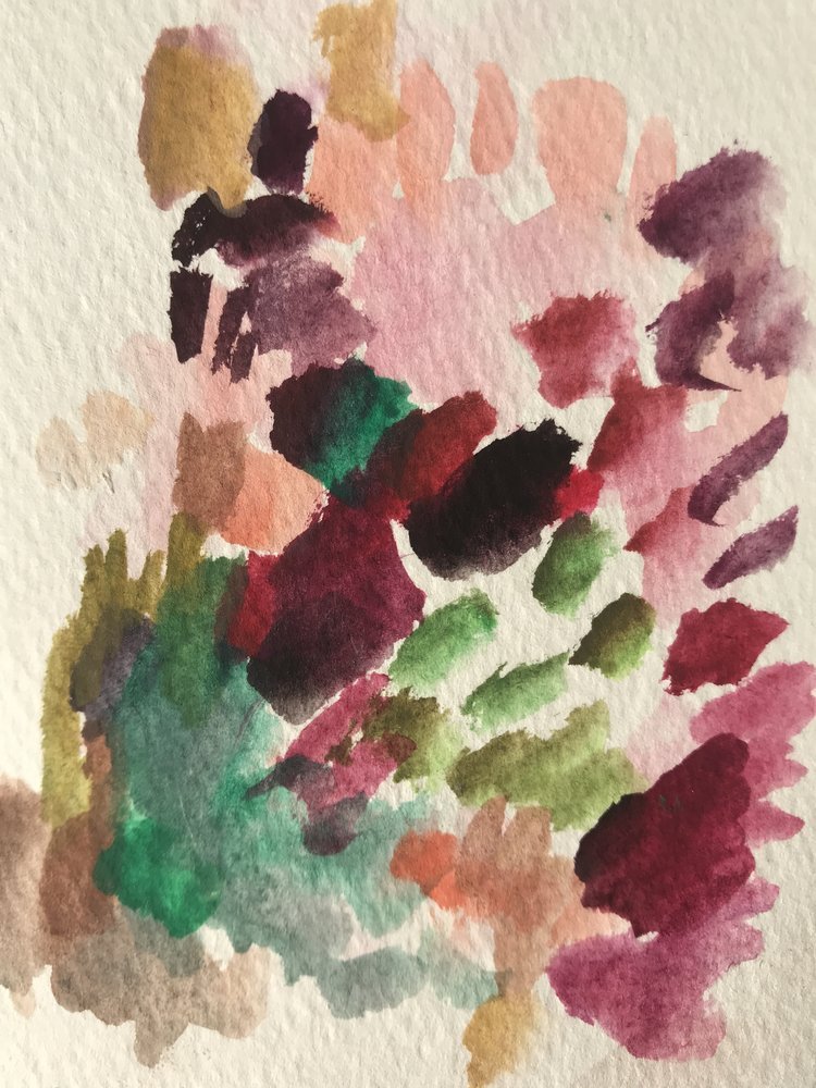
As you are working, try to remember that no color from nature is going to come straight out of a pan or tube of paint. Allow your paints to mix and don't worry if the pans get dirty themselves (I know that is going to be really hard for some of you--I've had your type in class before!). You can always clean them up at the end or after a while. All of that mixing is going to help make your illustration feel more natural.
For example, if I'm painting in a nice big Cafe Au Lait dahlia, I'm going to mix some white with a tiny bit of red, some orange, and probably some yellow- but not all at the same time. The center of the flower has more yellow and pink. The outside is more cream. None of it is plain white. I hope that makes sense.
I usually paint in the feature flowers first. If I totally botch one of them, I haven't wasted time on the rest of the less-important details, and it is easier to start over. Then I paint in the smaller flowers. Lastly, I add the color to the foliage, stems, and ribbon. (It is the same order that I drew them in.)

To watch the full video lesson, please click the YouTube link below.
As always, thank you for following along with my blog and newsletter. I really can't tell you how much your support and interest means. Please share questions and ideas in the comments below.
Thank you,
