
Photographing Dark Flowers
One of the biggest challenges for our cameras are those dark, or very bright pink/red colored flowers. This post aims to help you capture better photos of them, with truer colors and more detail!
First— it’s good to know why our cameras are so challenged by these colors compared to other flowers.
TOO MUCH CONTRAST
One common problem is too much contrast in our scene. If we’re taking photos against a light background or on a sunny day outside, most cameras are going to have a difficult time determining how white balance and lighting settings should be applied to your dark subject. This is because the flowers are so far in value from their surroundings. We also encounter this problem if we are trying to photograph very light colored flowers (white) right next to dark flowers.
If this seems to be a problem for you, trying photographing your dark color flowers in a darker space (and away from light subjects), or least against a middle-toned background. This is one reason that my beige hall paint works so well for all the flowers we grow here. Any color looks great against it. If I was to try a bright white background, I’d have difficulty showcasing the darker blooms.
This is an important thing for us to consider as designers, too. When we send floral design work out into the world that is very high in contrast with little or no “middle tone” colors, not only are we actually making it difficult in some ways for people to see our work, but we’re also making our work difficult to photograph by the professional photographers at events.

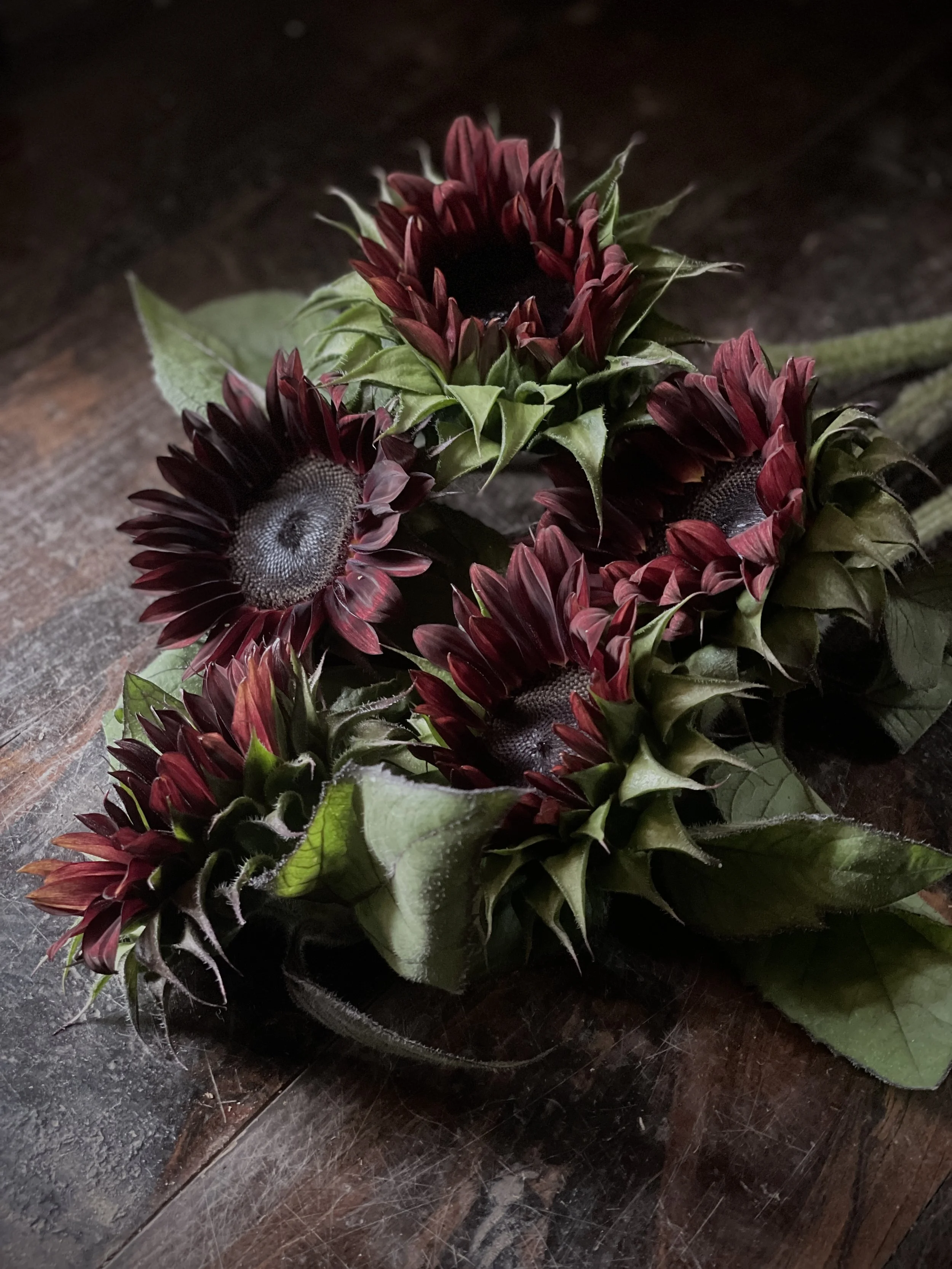

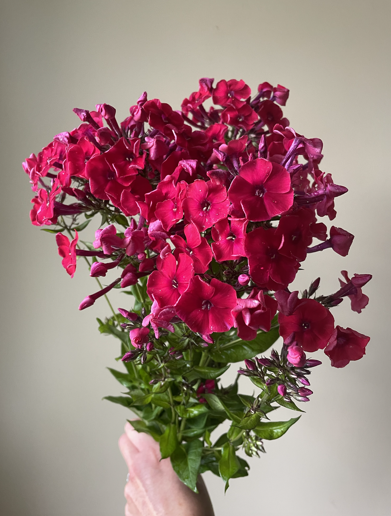
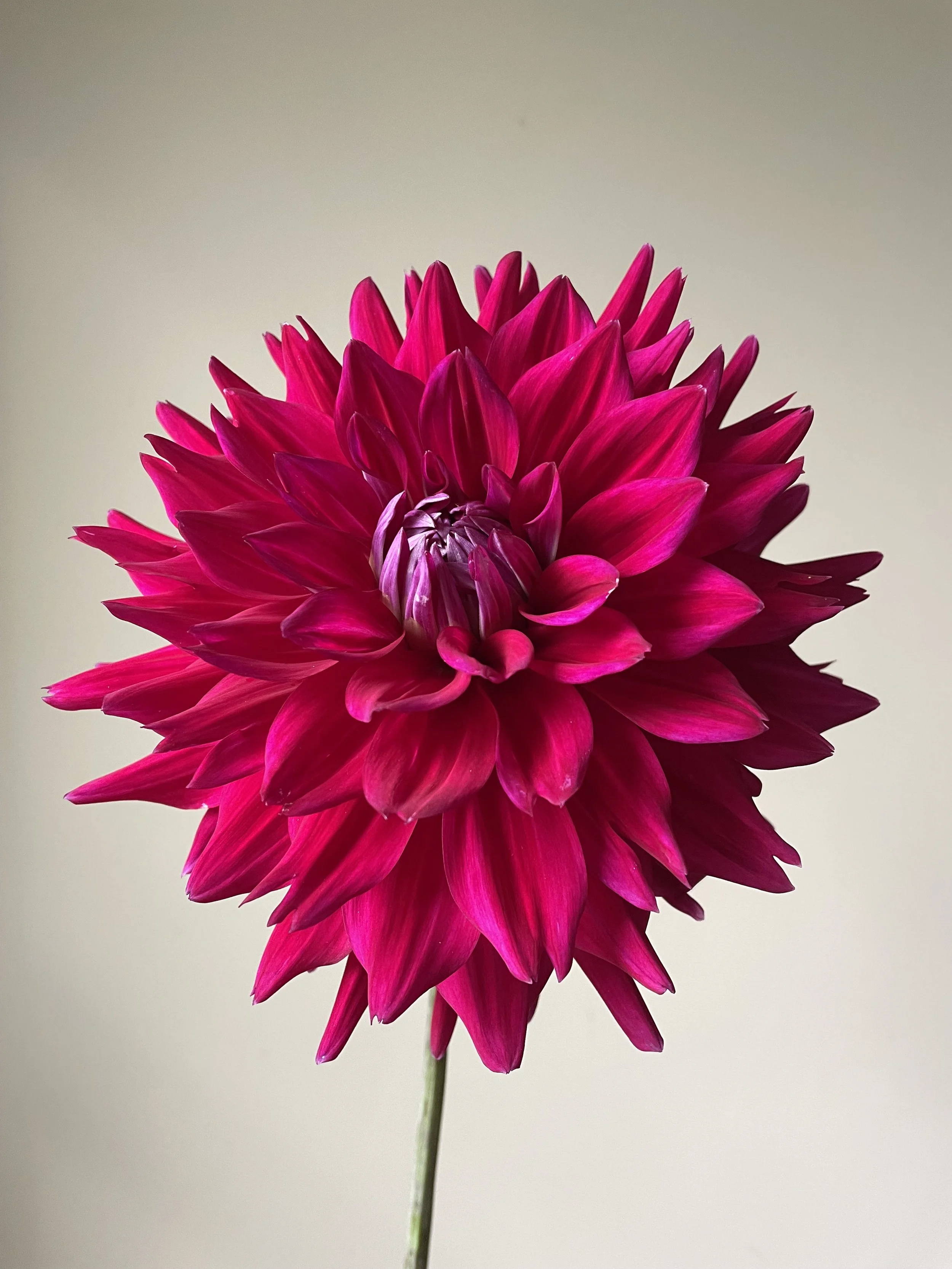
The images above demonstrate two recommended practices for photo graphing dark flowers and/or bright red/pink flowers. 1. Photograph these kinds of flowers in a darker setting or intentionally underexpose the image so that the detail is not lost in your red flowers. 2. Use a neutral (middle tone) background so that the camera will fight less to use it’s light meter properly.
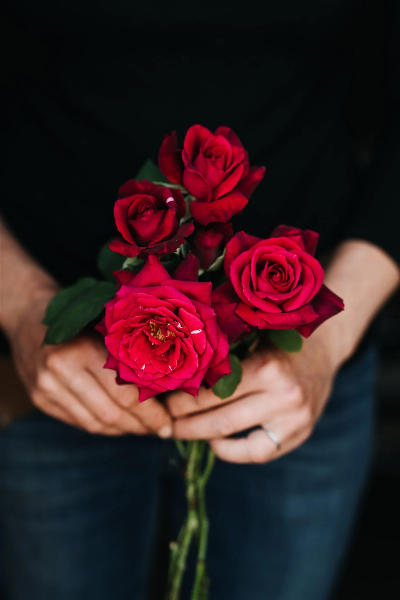
TROUBLE WITH RED
Another common problem is difficulty capturing the color red. Digital cameras are more sensitive to the color red than they are to the other digital colors (blue and green). We are talking about the RGB scale here (red, green, blue). This scale is used for digital displays, like laptops and mobile phones - things that are illuminated (as opposed to things that are printed with ink on a CMYK (cyan, magenta, yellow, black) scale.
Technology is getting better all the time, but red is still a challenge for many digital devices in a way that wasn’t a problem for film photographers. Red is also a challenge for us as humans, because it sits at the end of the spectrum that is visible to us.
Sometimes this “red problem” results in images of red flowers that are over exposed and lose details (too bright). One solution is to intentionally under expose images with red colors and then brighten surrounding parts of your scene in editing.
If your “reds” are coming out too orange or too purple, you can also make some simple adjustments, even just right in Instagram to correct the problem. Choose a still image and, in the Instagram photo editor, choose the “Warmth” slider. move the slider left or right to achieve more true-to-life color.
Tying it all together:
Give yourself some grace as you’re learning and improving your photography techniques. Remember that photography is an art form and a profession for people who do it full time.
I’m firm believer in the the statement: “You can do anything. You can’t do everything.” There aren’t enough years in our lives for us to become experts at everything we’d like to be experts at.
And there are an endless number of methods and techniques to learn just within this field of art. Set aside some time to experiment for a few hours to discover some standard settings that work for your flowers/designs. Once you know where to go when you have a darker subject and how to capture it, you can make that practice routine and easy.